Text
A component for rendering text.
Usage
import { Text, View } from "@swmansion/smelter";import Smelter from "@swmansion/smelter-node";
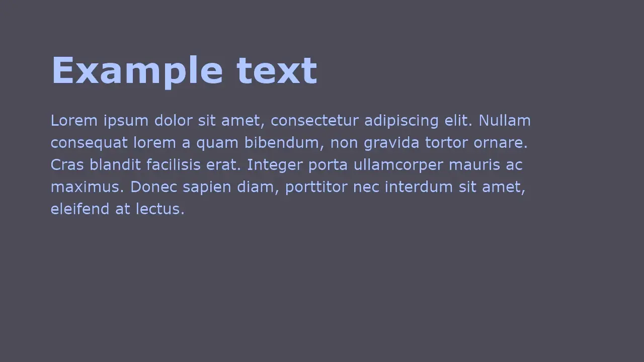
function ExampleApp() { return ( <View style={{ backgroundColor: "#52505b", padding: 100, direction: "column", }}> <Text style={{ fontSize: 72, color: "#a5baf0", fontWeight: "bold" }}> Example text </Text> <View style={{ height: 30 }} /> <Text style={{ fontSize: 30, lineHeight: 44, color: "#a5baf0", wrap: "word", width: 1000, }}> Lorem ipsum dolor sit amet, consectetur adipiscing elit. Nullam consequat lorem a quam bibendum, non gravida tortor ornare. Cras blandit facilisis erat. Integer porta ullamcorper mauris ac maximus. Donec sapien diam, porttitor nec interdum sit amet, eleifend at lectus. </Text> </View> );}
22 collapsed lines
async function run() { const smelter = new Smelter(); await smelter.init();
await smelter.registerOutput("output", <ExampleApp />, { type: "mp4", serverPath: "./output.mp4", video: { encoder: { type: "ffmpeg_h264", preset: "ultrafast", }, resolution: { width: 1920, height: 1080, }, }, });
await smelter.start();}void run();Example output
Reference
Type definitions
type TextProps = { id?: string; children?: (string | number)[] | string | number; style?: TextStyleProps;}Props
children
Text content to be displayed.
- Type:
string | number | (string | number)[]
id
ID of a component.
- Type:
string - Default value: Value produced by
useIdhook
style
Text styling properties.
- Type:
TextStyleProps