View
The View component serves as the core layout mechanism in the Smelter API, similar to the <div> tag in HTML. It acts as a container that offers basic styling options and can be further customized and composed.
Usage
Update request
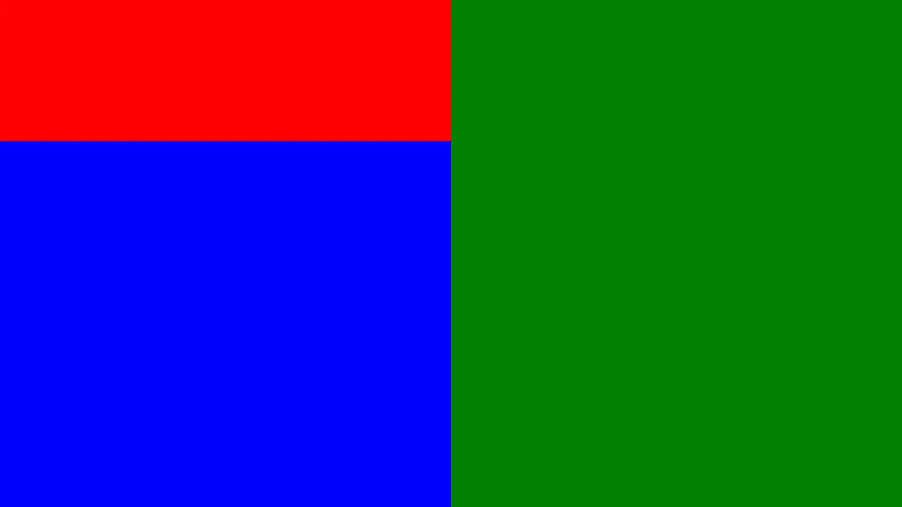
POST: /api/output/example_output/updateContent-Type: application/json
{  "video": {    "root": {      "type": "view",      "children": [        {          "type": "view",          "direction": "column",          "children": [            { "type": "view", "background_color": "red", "height": 200 },            { "type": "view", "background_color": "blue" }          ]        },        { "type": "view", "background_color": "green" }      ]    }  }}
Example output
Positioning
Absolute
A component is absolutely positioned when it specifies style properties such as top, left, right, bottom, or rotation. These properties determine the component’s position relative to its parent. However, the parent component must support absolute positioning for these values to take effect.
Viewsupports absolute positioning for its child components. If thewidthandheightare not explicitly provided, an absolutely positioned child will inheritwidthandheightfrom its parent.Viewcan be absolutely positioned relative to its parent if the parent component supports it.
Static
When children of a View component have a static position, they are placed next to each other.
For direction=row:
Children of a View component form a row, with items aligned to the top. The size of each child will be calculated in the following way:
- If the
widthorheightof a child component is defined, then those values take priority. - If the
heightis not defined, the component will have the sameheightas its parent. - If the
widthis not defined, we calculate the sumwidthof all components with that value defined.- If it is larger than the parent’s
width, then thewidthof the rest of the components is zero. - If it is smaller than the parent’s
width, calculate the difference and divide the resulting value equally between all children with unknown widths.
- If it is larger than the parent’s
For direction=column:
Analogous to the direction=row case, but children form a column instead, with items aligned to the left.
Transitions
On the scene update, a View component will animate between the original state and the new one if the transition field is defined. Both the original and the new scene need to define a component with the same id. Currently, only some of the fields support animated transitions:
width/height- Only supported within the same positioning mode. If the positioning mode changes between the old scene and the new one, the transition will not work.bottom/top/left/right/rotation- Only supports transition when changing a value of the same field. If the old scene defines aleftfield and the new one does not, the transition will not work.
Reference
Type definitions
type View = { id?: string; children?: Component[]; width?: f32; height?: f32; direction?: "row" | "column"; top?: f32; left?: f32; bottom?: f32; right?: f32; rotation?: f32; transition?: Transition; overflow?: "visible" | "hidden" | "fit"; background_color?: string; border_radius?: f32; border_width?: f32; border_color?: string; box_shadow?: BoxShadow[]; padding?: f32; padding_vertical?: f32; padding_horizontal?: f32; padding_top?: f32; padding_right?: f32; padding_bottom?: f32; padding_left?: f32;}Properties
id
ID of component.
- Type:
string
children
List of component’s children.
- Type:
Component[]
width
Width of a component in pixels.
- Type:
f32
height
Height of a component in pixels.
- Type:
f32
direction
Defines how static children are positioned inside a View component.
- Type:
"row" | "column" - Default value:
"row" - Supported values:
"row"- Children are positioned from left to right."column"- Children are positioned from top to bottom.
top
Specifies the distance in pixels from the top edge of a component to the top edge of its parent component. If this attribute is set, the element will be positioned absolutely, overriding any layout constraints imposed by its parent.
- Type:
f32
left
Specifies the distance in pixels from the left edge of a component to the left edge of its parent component. If this attribute is set, the element will be positioned absolutely, overriding any layout constraints imposed by its parent.
- Type:
f32
bottom
Specifies the distance in pixels from the bottom edge of a component to the bottom edge of its parent component. If this attribute is set, the element will be positioned absolutely, overriding any layout constraints imposed by its parent.
- Type:
f32
right
Specifies the distance in pixels from the right edge of a component to the right edge of its parent component. If this attribute is set, the element will be positioned absolutely, overriding any layout constraints imposed by its parent.
- Type:
f32
rotation
Specifies the rotation of a component, measured in degrees. If this attribute is set, the element will be positioned absolutely, overriding any layout constraints imposed by its parent.
- Type:
f32
transition
Defines how this component will behave during a scene update. This will only have an effect if the previous scene already contained a View component with the same id.
- Type:
Transition
overflow
Controls the behaviour of the content exceeding the area size.
- Type:
"visible" | "hidden" | "fit" - Default value:
"hidden" - Supported values:
"visible"- Render everything, including content that extends beyond their parent."hidden"- Render only parts of the children that are inside their parent area."fit"- If children components are too big to fit inside the parent, resize everything inside to fit.
background_color
Background color in #RRGGBBAA format.
- Type:
string - Default value:
#00000000
border_radius
Radius of a rounded corner.
- Type:
f32 - Default value:
0.0
border_width
Border width.
- Type:
f32 - Default value:
0.0
border_color
Border color in a "#RRGGBBAA" format.
- Type:
string - Default value:
"#00000000"
box_shadow
List of box shadows.
- Type:
BoxShadow[]
padding
Specifies the padding for each side of a component.
- Type:
f32 - Default value:
0.0
padding_vertical
Specifies the padding for the top and bottom side of a component.
- Type:
f32 - Default value:
0.0
padding_horizontal
Specifies the padding for the left and right side of a component.
- Type:
f32 - Default value:
0.0
padding_top
Specifies the padding for the top side of a component.
- Type:
f32 - Default value:
0.0
padding_right
Specifies the padding for the right side of a component.
- Type:
f32 - Default value:
0.0
padding_bottom
Specifies the padding for the bottom side of a component.
- Type:
f32 - Default value:
0.0
padding_left
Specifies the padding for the left side of a component.
- Type:
f32 - Default value:
0.0
Transition
type Transition = { duration_ms: f64; easing_function?: EasingFunction; should_interrupt?: boolean;}Properties
duration_ms
Duration of a transition in milliseconds.
- Type:
f64
easing_function
Easing functions are used to interpolate between two values over time during transition.
- Type:
EasingFunction - Default value:
"linear"
should_interrupt
If true, on scene update a transition that is already in progress will be interrupted and a new transition will start from the current state.
- Type:
boolean - Default value:
false
BoxShadow
type BoxShadow = { offset_x?: f32; offset_y?: f32; color?: string; blur_radius?: f32;}Properties
offset_x
Specifies the horizontal offset on the x-axis. Positive values move the element to the right, negative values move it to the left.
- Type:
f32 - Default value:
0.0
offset_y
Specifies the vertical offset on the y-axis. Positive values move the element downward, negative values move it upward.
- Type:
f32 - Default value:
0.0
color
Color in a "#RRGGBBAA" format.
- Type:
string - Default value:
#FFFFFFFF
blur_radius
Defines the radius of the blur effect.
- Type:
f32 - Default value:
0.0
EasingFunction
type EasingFunction = | { function_name: "linear"; } | { function_name: "bounce"; } | { function_name: "cubic_bezier"; points: [f64, f64, f64, f64]; }Easing functions are used to interpolate between two values over time.
Custom easing functions can be implemented with cubic Bézier.
The control points are defined with points field by providing four numerical values: x1, y1, x2 and y2. The x1 and x2 values have to be in the range [0; 1]. The cubic Bézier result is clamped to the range [0; 1].
You can find example control point configurations here.
Properties
function_name
Duration of a transition in milliseconds.
- Type:
linear | bounce | cubic_bezier - Default value:
linear - Supported values:
linearbouncecubic_bezier
points
Four numerical values in [0; 1] range used for cubic Bézier. The result is clamped to the range [0; 1].
- Type:
[f64, f64, f64, f64]