Rescaler
A layout component that will resize its children to match its own size. It will always preserve aspect ratio while resizing.
Usage
Update request
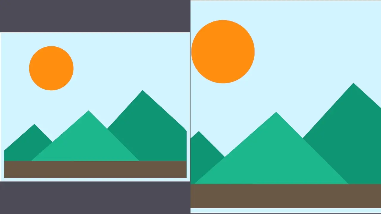
POST: /api/output/example_output/updateContent-Type: application/json
{  "video": {    "root": {      "type": "view",      "background_color": "#52505b",      "children": [        {          "type": "rescaler",          "child": { "type": "image", "image_id": "example_image" }        },        {          "type": "rescaler",          "mode": "fill",          "child": { "type": "image", "image_id": "example_image" }        }      ]    }  }}
Example output
Positioning
Absolute
A component is absolutely positioned if it defines fields like top, left, right, bottom, or rotation. Those fields define the component’s position relative to its parent. However, to respect those values, the parent component has to be a layout component that supports absolute positioning.
Rescalerdoes not support absolute positioning for its child components. A child component will still be rendered, but all fields liketop,left,right,bottom, androtationwill be ignored.Rescalercan be absolutely positioned relative to its parent, if the parent component supports it.
Static
Rescaler always have exactly one child that will be proportionally rescaled to match the parent.
Transitions
On the scene update, a Rescaler component will animate between the original state and the new one if the transition field is defined. Both the original and the new scene need to define a component with the same id. Currently, only some of the fields support animated transitions:
width/height- Only supported within the same positioning mode. If the positioning mode changes between the old scene and the new one, the transition will not work.bottom/top/left/right/rotation- Only supports transition when changing a value of the same field. If the old scene defines aleftfield and the new one does not, the transition will not work.
Reference
Type definitions
type Rescaler = { id?: string; child: Component; mode?: "fit" | "fill"; horizontal_align?: "left" | "right" | "justified" | "center"; vertical_align?: "top" | "center" | "bottom" | "justified"; width?: f32; height?: f32; top?: f32; left?: f32; bottom?: f32; right?: f32; rotation?: f32; transition?: Transition; border_radius?: f32; border_width?: f32; border_color?: string; box_shadow?: BoxShadow[];}Properties
id
ID of a component.
- Type:
string
child
Exactly one child component.
- Type:
Component
mode
Content resize mode.
- Type:
"fit" | "fill" - Default value:
"fit" - Supported values:
"fit"- Resizes the component to match one dimension of the parent while ensuring it remains fully visible."fill"- Resizes the component to cover the entire area of the parent by matching at least one dimension; excess is clipped.
horizontal_align
Horizontal alignment.
- Type:
"left" | "right" | "justified" | "center" - Default value:
"center"
vertical_align
Vertical alignment.
- Type:
"top" | "center" | "bottom" | "justified" - Default value:
"center"
width
Width of a component in pixels.
- Type:
f32
height
Height of a component in pixels.
- Type:
f32
top
Specifies the distance in pixels from the top edge of this component to the top edge of its parent component. If this attribute is set, the element will be positioned absolutely, overriding any layout constraints imposed by its parent.
- Type:
f32
left
Specifies the distance in pixels from the left edge of this component to the left edge of its parent component. If this attribute is set, the element will be positioned absolutely, overriding any layout constraints imposed by its parent.
- Type:
f32
bottom
Specifies the distance in pixels from the bottom edge of this component to the bottom edge of its parent component. If this attribute is set, the element will be positioned absolutely, overriding any layout constraints imposed by its parent.
- Type:
f32
right
Specifies the distance in pixels from the right edge of this component to the right edge of its parent component. If this attribute is set, the element will be positioned absolutely, overriding any layout constraints imposed by its parent.
- Type:
f32
rotation
Specifies the rotation of a component, measured in degrees. If this attribute is set, the element will be positioned absolutely, overriding any layout constraints imposed by its parent.
- Type:
f32
transition
Defines how this component will behave during a scene update. This will only have an effect if the previous scene already contained a Rescaler component with the same id.
- Type:
Transition
border_radius
Radius of a rounded corner.
- Type:
f32 - Default value:
0.0
border_width
Border width.
- Type:
f32 - Default value:
0.0
border_color
Border color in a "#RRGGBBAA" format.
- Type:
string - Default value:
"#00000000"
box_shadow
List of box shadows.
- Type:
BoxShadow[]
Transition
type Transition = { duration_ms: f64; easing_function?: EasingFunction; should_interrupt?: boolean;}Properties
duration_ms
Duration of a transition in milliseconds.
- Type:
f64
easing_function
Easing functions are used to interpolate between two values over time during transition.
- Type:
EasingFunction - Default value:
"linear"
should_interrupt
If true, on scene update a transition that is already in progress will be interrupted and a new transition will start from the current state.
- Type:
boolean - Default value:
false
BoxShadow
type BoxShadow = { offset_x?: f32; offset_y?: f32; color?: string; blur_radius?: f32;}Properties
offset_x
Specifies the horizontal offset on the x-axis. Positive values move the element to the right, negative values move it to the left.
- Type:
f32 - Default value:
0.0
offset_y
Specifies the vertical offset on the y-axis. Positive values move the element downward, negative values move it upward.
- Type:
f32 - Default value:
0.0
color
Color in a "#RRGGBBAA" format.
- Type:
string - Default value:
#FFFFFFFF
blur_radius
Defines the radius of the blur effect.
- Type:
f32 - Default value:
0.0
EasingFunction
type EasingFunction = | { function_name: "linear"; } | { function_name: "bounce"; } | { function_name: "cubic_bezier"; points: [f64, f64, f64, f64]; }Easing functions are used to interpolate between two values over time.
Custom easing functions can be implemented with cubic Bézier.
The control points are defined with points field by providing four numerical values: x1, y1, x2 and y2. The x1 and x2 values have to be in the range [0; 1]. The cubic Bézier result is clamped to the range [0; 1].
You can find example control point configurations here.
Properties
function_name
Duration of a transition in milliseconds.
- Type:
linear | bounce | cubic_bezier - Default value:
linear - Supported values:
linearbouncecubic_bezier
points
Four numerical values in [0; 1] range used for cubic Bézier. The result is clamped to the range [0; 1].
- Type:
[f64, f64, f64, f64]